The Microsoft office suite has a large number of elements that can help us to perform different types of tasks at any time, being among the most used its module of Word, Excel, PowerPoint and a few others.
Microsoft Excel is preferably used by people who are used to work with statistical graphs, which come to be a great support for those who see them because with this, they have a better vision of what may be happening with some environment that is the reason for the analysis. Now, if we do not have the Microsoft office suite and we need this resource, then below we will mention a few alternatives that you can use completely free and from the web.
ChartGizmo
Despite the fact that this online tool called «ChartGizmo»Can be used for free, the user has to open an account to use each of its services. Once this first step has been carried out, you will be able to choose from some of its templates to enter the data that is the subject of an analysis.
You can get bar, line or pie charts in both 2D and 3D. The user can choose the type of orientation, colors, labels and a few other aspects in the final result.
ChartGo
«ChartGo»Is another interesting alternative that will help us to obtain statistical graphs in 2D or 3D, which may well be structured in bars, lines or pie.
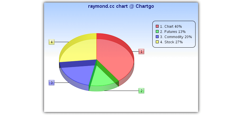
Along with the traffic generated, the percentages that belong to each of them with their respective nomenclature will be displayed. The user has the possibility to resize these graphics depending on what you need to use in your final project.
chartle.net
With "chartle.net»The user has the possibility to choose from a wide variety of statistical graphs to use with their respective data; according to the developer, his proposal relies on what Google Charts offers.
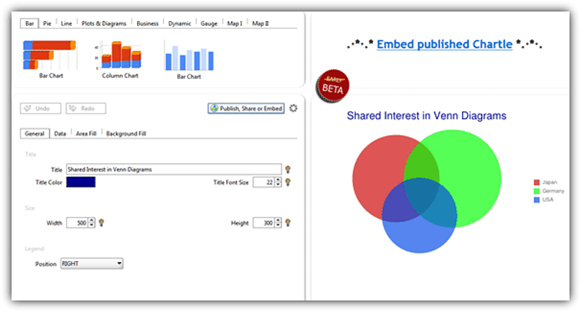
Very easily it is possible to have a graph of bars, circular, lines, with a radar aspect, meters among many other additional alternatives; in the final result, this online tool will provide users with a code that can be used on the website of the interested party.
DIY Chart
«DIY Chart»Is another online tool that can be used for the same purpose. It has the same options that we have mentioned above although, with a few additional ones that make it the preferred one for many.
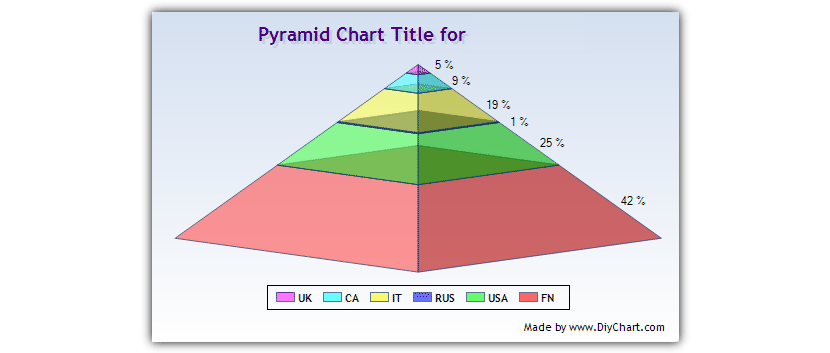
For example, besides a bar chart, pie, lines and much more, here too you can get to structure a statistical pyramid; The graphics that you get to generate in this alternative will be supported by the data that you import from a .txt or .csv file, the latter that can be easily obtained from any electronic sheet you have.
ChartTool
Depending on each need, «ChartTool»You can structure a personalized bar chart, which shows areas that are of interest for a specific analysis.
You can choose from among many alternatives to make the graphics, since these They can be bar, pie, scattered one, and much more. The final result will have to be obtained in the format of an image in JPG or PNG, also having the possibility of having it as a PDF or a CSV.
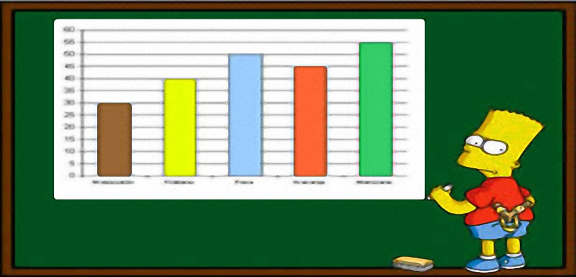
BARCHART Generator
Although this alternative does not have a graphic elegance as could have been enjoyed in the previous alternatives, but «BARCHART Generator» is the favorite of many people due to its the ease of use that it has.
Like the previous ones, from here you also have the possibility of make a bar chart, a pie chart or a line chart, although you will not enjoy any type of shine or special effects in the final result. Here the basic colors and a perfectly well defined nomenclature will be used that will be easy for everyone to understand. The only drawback may be in the data entry, because here it has to be done manually for both the labels and their values, which have to be placed separated by a «,».